
Mapping "Live" COVID Data on a Globe with Mathematica
A small article about how to present data on a globle. I published the notebook in the Wolfram Community where he got a “Staff Picks” mention. This article uses the data about the COVID-19 provided by the Johns Hopkins CSSE Github. But any data could be used! I use COVID-19 date because its popular right now.
Auto Update your Data
If you have Github installed on your system, you can use the following command to update an initialized copy of the Johns Hopkins CSSE Github repertory.
SetDirectory["path"];
RunProcess[{"git", "pull"}, "StandardOutput"]
Getting The Map (Without the use of Database)
The following commands allow you to prepare a basic map (cylindric projection) using GEOJSON data files that contain a polygon for each country. The one used here is available on here on my cdn . I forgot the original source, I think it was this one: datahub .
countryPoly = Import["path", "JSON"];
countryPolyDs = (Association[
       Flatten[{"properties" /. #, "geometry" /. #}]] & /@
     Values[countryPoly[[2]]]) // Dataset;
So the database look like that:

And all the available countries are named has such:
countriesAvailable = countryPolyDs[;; , "ADMIN"] // Normal;
Multicolumn[countriesAvailable, 4]

The following function gets the polygon data contained in the JSON and prepare Mathematica Polygon objects.
getPoly[target_String] :=
  If[countryPolyDs[SelectFirst[#ADMIN == target & ], #type &] ==
    "MultiPolygon",
   Polygon /@ (countryPolyDs[
       SelectFirst[#ADMIN == target & ], #coordinates &] // Normal),
   Polygon[
    countryPolyDs[SelectFirst[#ADMIN == target & ], #coordinates &] //
      Normal]
   ];
Now we can create a basemap:
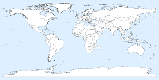
Using ColorData we can add a bit of color on the basemap. I think you are guessing how we will put our data on the map!
{EdgeForm[{Thin, Black}]}~Join~
   Join[Riffle[getPoly /@ countriesAvailable,
     FaceForm[{#}] & /@ ColorData[35, "ColorList"]]] //
  Graphics[#, Background -> LightBlue,
    ImageSize -> Large] & // Rasterize

Getting the data from the Github repertory
First we load the data from each file, then we will interpret them. We use the interpreter for the number, and we apply the DateObject function on the right columns. The DateObject function will return few errors because of the date formatting that was used in the first versions.
dateAvailable =
  FileNames[] // StringCases[DigitCharacter ..] // DeleteCases[{}];
rawData =
  Import[#, "CSV"] & /@ (StringTemplate["``-``-``.csv"] @@ # & /@
     dateAvailable);
interpreter = {#[[2]],
    DateObject[#[[3]]],
    Interpreter["Number"][ #[[4]] ],
    Interpreter["Number"][ #[[5]] ],
    Interpreter["Number"][ #[[6]] ]
    } &;
dataFrame =
  If[MissingQ[#], 0, #] & //@
   ParallelMap[interpreter, Flatten[Rest /@ rawData, 1]];
Let's take the data from yesterday, we suppose they are complete. We could use the data from today, but the Github might not have been updated.
dataFrame = DeleteCases[dataFrame, FailureQ[#[[1]]] &];
yesterdayData = (GatherBy[
    Select[dataFrame, DateWithinQ[Yesterday, #[[2]]] & ], First]);
totalByCountry =
  Prepend[Total[#[[;; , {3, 4, 5}]]], #[[1, 1]]] & /@ yesterdayData;
Some countries won't be recognized because they are named differently. Here I correct some, but I'll let few to show the differences.
totalByCountry =
  totalByCountry /. {"US" -> "United States of America",
    "Korea, South" -> "South Korea", "Taiwan*" -> "Taiwan"};
Grid[{#[[1]], #[[2]], #[[3]], #[[4]]} & /@ totalByCountry]
Preparing the 2D Map
The 2D map is the important one since it is more useful in many situations to work with two-dimensional representations. Still we will make a 3D globe in the next section!
Countries in the data:
selected =
  Select[MemberQ[countriesAvailable, #[[1]]] &][
   totalByCountry[[ ;; ]]];
selected[[;; , 1]] // Multicolumn[#, 4] &
Some countries were not recognized, I corrected some of them already in the previous section:
Select[\[Not] MemberQ[countriesAvailable, #[[1]]] &][
  totalByCountry[[ ;; ]]] // Multicolumn[#[[;; , 1]], 5] &
Now we are ready to colour our map!
cs = ColorData[{"TemperatureMap", {0, Log[100000]}}];
cvmap = (basemap~Join~
     Join[{FaceForm[ cs[ If[#[[2]] != 0, Log[#[[2]]], 0]]   ],
         getPoly[#[[1]]]} & /@ selected]) //
   Graphics[#, PlotRange -> {{-180, 180}, Automatic},
     Background -> LightBlue, ImageSize -> Large] &;
Row[{Rasterize[cvmap, ImageSize -> Large],
  BarLegend[{"TemperatureMap", {0, Log[100000]}}]}, Frame -> True,
 Background -> LightBlue]
Globe representation
This step is easier than I was thinking. Using SphericalPlot, we can apply a Texture on the sphere with the right mapping. The Automatic TextureCoordinateFunction from SphericalPlot does the hard work for us! Note the rotation I did on the picture.
Row[{
  SphericalPlot3D[1, \[Theta], \[Phi],
   Axes -> False,
   Boxed -> False,
   MeshStyle -> Directive[{Opacity[0.25]}],
    Background -> Black,
   ImageSize -> Large,
   PlotStyle -> {Texture[
      Rotate[Rasterize[cvmap, ImageSize -> Scaled[3]], \[Pi]/2]]
     }],
  BarLegend[{"TemperatureMap", {0, Log[100000]}},
   LabelStyle -> Directive[{EdgeForm[White], White}],
   LegendLabel -> Placed["Infections\n(Log Scale)", Right]
   ]
  }, Background -> Black]